Tuesday, July 31, 2012

Paper Piecing with Style


For my card today, I'm combing one of the new AI People images from the summer CHA release with Style.  I just love this woman's confidence and poise. I think this sentiment captures her mood.  :o)  I stamped the image with Memento black ink onto Gina K Pure Luxury 120lb Heavy Base Weight Card Stock.  I stamped  her a second time onto design paper and cut out her leotard.


Copics used:
  • skin: E11, E13, R21
  • hair band and top of shoes: R8, R24
  • hair, bottom of shoes: C3, C5, C7, C9
  • shading in white areas and on design paper: C1
I cut the main image using a Spellbinders die cut. The design paper is from BasicGrey. I used Sakura metallic pens for her lip stick and earring.  I used VersaFine to stamp the sentiment.

Please check with your local stamp or scrap booking store for availability of the AI images released at CHA. You can also check at Art Impressions in mid August for new AI people.  

Thank you for visiting!!

Take care and STAY POSITIVE!
Trena

mmmmm...Ice Cream!


Today I'm sharing a line that will be coming out this week called Moreheads.  Such adorable little children!

I started with the background layer.  I ran a piece of craft cardstock (SU!) through my handheld paper crimper. I used a blending tool and a tea dye Distress Ink pad to add some shading to the background layer.


Next, I stamped my cute little boy image twice onto Ultra Smooth Premium White Cardstock for Alcohol Markers.  I took out the Spectrum Noir Marker combo chart I made  to choose my colors. On the first image, I colored:
  • jeans ( TB3, TB5, TB6) and allowed the color to dry. To give his pants some texture, I dipped denim fabric into alcohol - it should be moist, not saturated. I laid the fabric over the colored area and pressed gently. The longer you leave the fabric down, the more color spreads. It spread beyond the lines, and that was OK because I planed to cut it out.  NOTE: the longer you leave the fabric on the cardstock, the more the color will spread.    
  •  ice cream cone-TN3, TN4, TN5, TN7, PP3, PP4, PP5 and his hand-TN3 on this piece of cardstock.    
I cut out his jeans, ice cream cone and hand. TIP: when you cut out a partial image, use a black marker to edge it.  It will help make the image pop and will fill in for any areas you may cut too close.On the second image I colored:
  • skin - TN3
  • eyes - TN7
  • hat- CR8, CR10, CR11, and a little blender for texture. 
  • gym shoe s- IG2
  • shirt - CT1, CT2, CT4, IG10
On the base image, I colored around edge of his jeans just to provide a little color if something does not match. I did the same thing for the ice cream, cone, and his hand (after I took the photo :o)).


I used a Spellbinders die cuts to cut out a circle around the image. I left the die cut on and used the blending tool to give a little color.   Adhered all the layers. Added a highlight to his eyes with a white Sharpie pen and some star dusk Stickles to his ice cream to finish it off.

Thanks for visiting!

Take care and STAY POSITIVE!  

Trena

Thursday, July 26, 2012

Art Impressions Challenge - Window Card (cut to see inside)


For this week's Art Impressions challenge - Window Card (cut to see inside), I picked the Bakery Window Shoppes set.   I took the layout idea from the Shoppe Window Idea Book.  Nothing original here, but hey! That's why Bonnie gives us the idea books! :o)

I stamped the Shoppe Window onto an X-press A2 size piece of cardstock, using Memento Ink.  I then stamped all the smaller images onto a second A2 size card, including the wooden crate.   Time for coloring! Used my Copic Markers to fill in color.


Next, I cut out the images and used a craft knife to cut the inside of the window out.    I adhered a layer of design paper (BasicGrey) to the outside of the base card, adhered the cut out window and then cut out the window again - this way, it's less layers to cut through.


To give me a guide for placement on the inside, I lightly traced the inside of the window with a pencil. I then adhered the cakes sitting on the crate and erased the pencil lines. I added a strip of design paper.  Lastly, I adhered the barrel and light pole on the outside.

Please pop over to the Art Impressions challenge for this week to see a bunch of inspirational window card ideas!  You can enter for a chance to win a coupon!!

Thanks for visiting!

Take care and STAY POSITIVE!  

Trena

Tuesday, July 24, 2012

Make that a Double, Please


Isn't he adorable?  I love his expression.  Here's a sneak peek in a line called AI Zoo Crew. The giraffe and sentiment are part of the Art Impressions CHA summer release. I colored him with Tombow Dual Brush Pens (603 and N00). I attended a class with Bonnie and Kate last week at Creative Cuts and Crafts in Elmhurst and this is one of the cards we made. We had a ball! There are so many cute images in the release! Please check with your local stamp or scrap booking store for availability. 


Thank you for visiting!!

Take care and STAY POSITIVE!
Trena


One Scene, Two Color Schemes


I love to work with silhouettes!  The possibilities are endless with masking and embossing and building color.   For my project this week, I stamped the island image from Sheena's A Little Bit Scenic - Silhouette Highlands set on two pieces of A2 size Ultra Smooth Premium White Cardstock for Alcohol Markers.   I recommend Memento for this coloring technique.  I've tried different types of cardstock with this technique and I really dig the Ultra Smooth - the colors blend so nicely!

I scribbled Spectrum Noir Markers onto a non-stick surface, spritzed with alcohol, picked up color with sponge and spread onto cardstock. Use a light touch and spritz often to keep ink flowing nicely over cardstock.  NOTE: be sure to start off cardstock and pull color across. I spread in a horizontal stroke for water and sky. 


The next card, I colored with tropical colors.  This was inspired by a card Dawn B. made - which you will see on Friday! I stared with just the yellow marker because I knew I wanted to mask a circle for the sun.


After I placed the mask on, I scribbled more color to pallet, spritzed, and spread color.

I trimmed both scenes down and mounted on design layers. The blue scene is on top of Club Scrap design cardstock.  The black cardstock and  ribbon are from Stampin' Up!

Can you guess what technique was used to create the tropical scene design layer?  Have you ever tried the shaving cream technique?! :o)   When I first learned the technique, I went crazy on backgrounds. :o)  For those of you who may have never used it, it's very simple. 
  • spray foam shaving cream into a shallow pan. Squirt a few drops of dye ink re-inker - pick as many colors as you like. I usually picked three and one metallic
  • with a knife, gently make swirl patterns.  Be careful not to mix colors
  • lay a piece of card stock on top of the colors and gently press. Let set for a few seconds 
  • pull straight up and scrap off shaving cream into a spare bowl or plate
  • repeat with several  pieces of cardstock. You can add more drops of re-inker at any time
 You'll get a nice surprise background. :o)

In each scene, I drew in the little birds and used a glitter pen add a few highlights in the water.   The sentiment is from Sheena's A Little Bit Sketchy Stamp Set - Optimism set.


Please visit the Crafter's Companion Info Blog every day this week to more ideas on how to use Sheena's new images. So many ideas flowing!!

Take care and STAY POSITIVE!  
Trena

Thursday, July 19, 2012

Art Impressions Challenge - Photo Inspiration


6/19 Photo Inspiration #2 This weeks Art Impressions Challenge is inspired by the lovely colors in the photo to the right.

I stamped the mailbox and little birds from the mailbox keeper set onto Ultra Smooth Premium White Cardstock for Alcohol Markers with Memento tuxedo black ink. Next, I colored!  I cut the images out.

I used design paper from BasicGrey for my background. On the inside, I stamped a branch from the WC oak tree image. I stamped the small vine image several times for the leaves and then adhered the birds.


Please pop over to the Art Impressions challenge for this week to see a bunch of inspirational color ideas!  You can enter for a chance to win a coupon!!

Thanks for visiting!

Take care and STAY POSITIVE!  

Trena


Wednesday, July 18, 2012

Bonnie and Donna in the Same week!


Click here to see how much fun I'm having this week!!  :o)

 Take care and STAY POSITIVE!  
Trena

Tuesday, July 17, 2012

Weight Watchers Points (Plus)


I've tried this - it does not work. :o) Everyone has to count his/her own points.  I had fun coloring this little scene using a variety of mediums. I used Copics Markers, Spectrum Noir Markers Distress Ink Pads,  chalks, and more...

When coloring with a variety of mediums, here are some general tips:
  • Color with alcohol inks first, so you do not risk damaging the tip.
    Use a light touch, build color.
  • Considering if mediums are wet or dry...If wet, need to work timely to blend. If dry, have more time. 
  • Start with a small amount, you can always add more.
  • Combine two or more!! No limit on mediums per art piece!!   Use your artistic license and have fun!

Here' what I did:

  • Laid down color with markers first (to identify colors, I underlined Copic, and to the right of the "-"  are the Spectrum Noir) . I colored skin & glasses (C3, C5, E000, E00, E11, E13, R21);  hair E08, 57, E77, E79 - TN8, DR7); dishes & table cloth BG11, BG13, C1; cake, hats, dresses R24, R81, Y11, Y13 - PL1, PL2; lipstick R24 - DR7
  •  Use pastels on dresses and hats
  •  Use metallic pens on jewelry
  •   To create shadow around scene, use blender tool with vintage photo Distress Ink pad - light touch
The design paper is from BasicGrey.

 Take care and STAY POSITIVE!  
Trena

Gelato Background


 I had such an awesome day on Monday! After dropping off greeting cards at Anderson's, I attended a class with Donna Downey!! What a fun and awesome teacher she is.  I took her 40 techniques class. Talk about action packed!  I'll be sharing photos at Stamping, Painting, and Color make me Giggle  later this week.

For my project today, I went through three background techniques in my mind, and then settled on this one. :o)

Started with inking up the Art-Kure elm tree image with VersaMark dazzle ink pad onto  Ultra Smooth Premium White Cardstock for Alcohol Marker. I sprinkled ultra thick clear embossing powder and heat set. Tip I learned from Donna.  For the thick powder, heat from the back. That way your powder does not fly all over.


Next, I colored onto the paper with Faber Castell gelato sticks.  I bought these little sticks last year and had only used them once. :o)  Donna inspired me to get them out.  I dipped them into water and colored all over the card stock.   After coloring the entire piece, I dipped my finger into the water and smoothed out all the color.  I wiped away the color over the embossed image with a baby wipe.


Thanks for visiting!

Take care and STAY POSITIVE!  
Trena

Monday, July 16, 2012

The Brannon Factory Greeting Cards in Downtown Naperville!

Andersons_logo

I'm so very excited to share that The Brannon Factory greeting cards will be available at Anderson's Bookshop in downtown Naperville starting this afternoon!! 
Take care and STAY POSITIVE!
Trena

Thursday, July 12, 2012

Art Impressions Challenge - Easel or More than One Fold


This weeks Art Impressions Challenge is all about the folds - what will you do with folds?! :o)  I decided to do a window card.

I started with a white 12" x 12" piece of card stock. I cut a piece 4" wide. Next I scored it at 4" and again at 4" to make a square card.  I stamped window front, window back and living room on watercolor paper with StazOn.

Next, I colored the images with Tombow Dual Brush Pens. I a combination of direct (color on paper, spread with a water brush) and in-direct (scribble marker on pallet, pick up with water brush and spread) techniques to fill in color on the windows and living room.  I cut them out.  NOTE: I could only fit a portion of the living room on my 4" card, so I had to let the end table go.


I used a Sizzix folder for the outside brick layer.  I stamped the outside window on it for placement and layered it on a piece of black card stock. Next, I cut the window  through those two layers.  I cut out the entire inside of the window. I knew my colored image curtains would match and so there was no need to cut all the detail of the curtains - one of the wonderful features of Fronts and Backs!

I adhered the layers onto my base card and cut the window in through the single layer. Much easier than trying to cut through three layers. :o) I used a liquid adhesive to adhere my window, which allowed me more time to shimmy the piece into place.


Next, I adhered Basic Grey design paper onto the second fold of my base card, for the wallpaper of my living room. I drew in the baseboard and color it with a brown marker.  I added color to the carpet with gray markers.  I also drew in a little light switch. I adhered the living room set and used a Sharpie white pen to put a little snow on the mountain tops of the picture on the wall.  I left lots of white space to write a long note inside.

I hope this fold card has inspired you! Please pop over the to AI challenge to see more fold cards from the Design Team and join in the fun for a chance to win a coupon!


Thanks for visiting!

Take care and STAY POSITIVE!  

Trena

Tuesday, July 10, 2012

Where Does Inspiration Come From?

Inspiration and ideas are everywhere! Color combinations and layouts are in magazine ads, on TV, in display windows, on a dress or outfit someone is wearing, etc, etc, etc…. I keep an Inspiration Journal with my drawings and pictures from magazines, articles, and ads. I also get inspiration from creative people.

Two projects I'm sharing today were inspired by a really cool print in the lobby of the hotel we stayed in during vacation last week, which by the way was fabulous - we drove from IL/MI to Myrtle Beach, SC in a 15 passenger van. The youngest passenger was 19 months and the oldest 77 years. Everyone was talking at the same time. The baby was loudest laughing and giggling. 

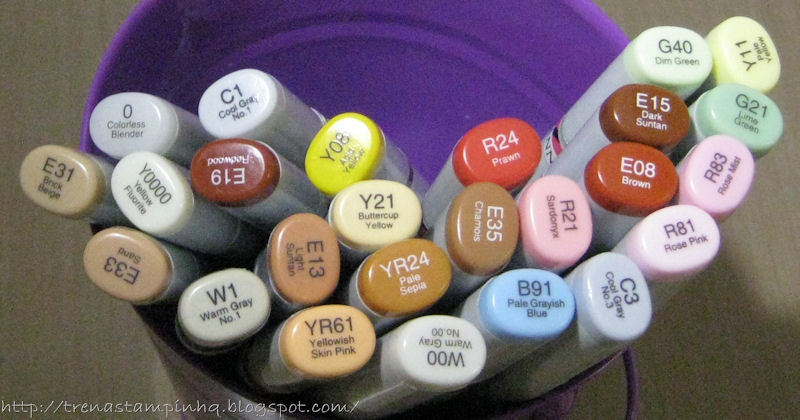
There are so many ways to color!   The medium I chose for coloring was inspired by a post by Cee Cee, which you can see here.

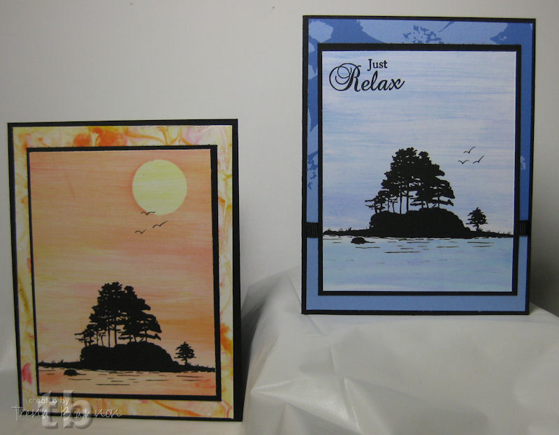
An ATC... (featured at the Art Impression Blog today)


Stamped Mini Roses in Vase image onto watercolor paper with StazOn jet black. Used a paint brush to apply liquid frisquet over image. You could also use masking tape. I find the liquid really nice for small areas. Allowed to dry.


Next I used Eclipse tape to mask, and used a blending tool with a black soot Distress Ink pad to create a dark circle with the image at the edge of it.


I then inked up the Friends are Flowers sentiment, stamped off on scratch paper and stamped onto the ATC. Repeated several times to create a 'word background.' To create the white boarder, I ripped the masking tape and placed around the image and circle. I used the blending tool and a walnut stain Distress Ink pad to add a little color.


Next, I dabbed a tissue over the frisquet to pick up any wet ink. I then removed the frisquet by gently rubbing my finger over it and pull it off.
 
Time to color! Colored image using brush pens direct to paper - starting in the area where I wanted the darkest shade,  then spread color with water brush. I used Sakura glaze and metallic pens to add a more color with a little bling. I trimmed it and layered it onto a piece of black card stock.


A Greeting Card...(featured at the Crafter's Companion Information Blog today)


Stamped  destination image onto watercolor paper with StazOn jet black.  Used paint brush to apply liquid frisquet over butterfly  image.


Next I cut a label shape with a Spellbinder dye cut on scrap card stock and used a blending tool with a crushed olive Distress Ink pad to create a scalloped arch with the butterfly at the edge of it.


To create the white border, I ripped masking tape and placed around the image. I used the blending tool and a walnut stain Distress Ink pad to add color.


Next, I dabbed a tissue over the frisquet to pick up any wet ink. I then removed the frisquet by gently rubbing my finger over it and pull it off.

 Time to color! Colored image using brush pens direct to paper - starting in the area where I wanted the darkest shade,  then spread color with water brush. I used a Sakura glaze pen to add more color.


To complete the card I chose design papers from from Stampin' Up! and a paper I made with glitter sprays.  The stripe design did not have all the colors I wanted, so I  used a ruler and two of the pen colors in my butterfly to add some more lines.  On the inside, I adhered a piece of design paper, colored the butterfly part of the image with a water based maker and stamped.


Thanks for visiting!

Take care and STAY POSITIVE!  

Trena